As a shop owner, having nice photos can get you featured in many more treasuries.
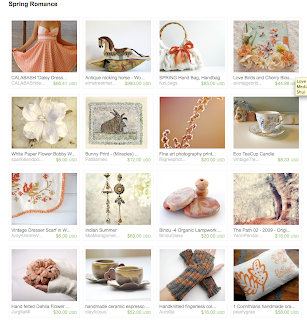
Check out this treasury from tpt member Zion Shore.

Notice the photography? The most interesting photos are the ones that are slightly off center, with a plain background. Think how uninteresting that bag would look if it was on your couch being photographed straight on.
To summarize-
As a shop owner:
- Make your first photo be the most interesting even if it doesn't show the entire product. You can show the detail in the rest of your supporting photographs. I usually click on listings in which the first photo makes me feel like I want to see more. Click HERE for a great example of this. (This shop has been on the front page multiple times)
- Keep your backgrounds simple. A stripey couch or dotted bed spread might not be the best place to show off your product. The background should not be distracting.
- Try to show your product "in use" in at least one photo. For example if you are selling a hair clip, have a friend wear it and take photos outside for plenty of natural light and an editorial feel. Click HERE to see a good example of this.
- Look at previous front page treasuries and note what type of photos are most common.
- When torn between 2 items, go for the one with the most simple, clean look.
- pick photos with similar styles in one treasury, this gives the treasury a cohesive look. Take a look at this TPT member's treasury for a good example of this.
- Be sure to put the most interesting photos in the top 4 spots of the treasury. These are the ones that are seen when browsing through treasuries. This will pull in more views.


What a wonderful post. I totally agree that simple and clean is always the best choice!
ReplyDeleteThank-you for using one of my treasuries as the example :)
Mags, your posts are wonerful. Great tips and thanks for sharing with everyone.
ReplyDeleteThese are great tips as usual!!! Thank you so much for sharing!
ReplyDeleteYou are so right, I haven´t thought about it but pictures that offer a bit of mystery, that I don´t immediately understand that are the ones that gets me interested and clicking.
ReplyDeleteAbout photography advice, the best I ever got was "take more". you can take 50 pictures of an item and they can all be bad, but if you take 50 more they usually improved.
Great Stuff! You Guys are Rockin!
ReplyDeleteThis is a really great post, fantastic information! I'm working on fine tuning my photos now
ReplyDeleteThank you for those pearls of wisdom. I found them very helpful coz I am still trying to improve on my photos.
ReplyDeletehttp://www.lutachi.etsy.com